FASHION, MEET FURNITURE
“The Tio concept is a collaboration of creative minds.”


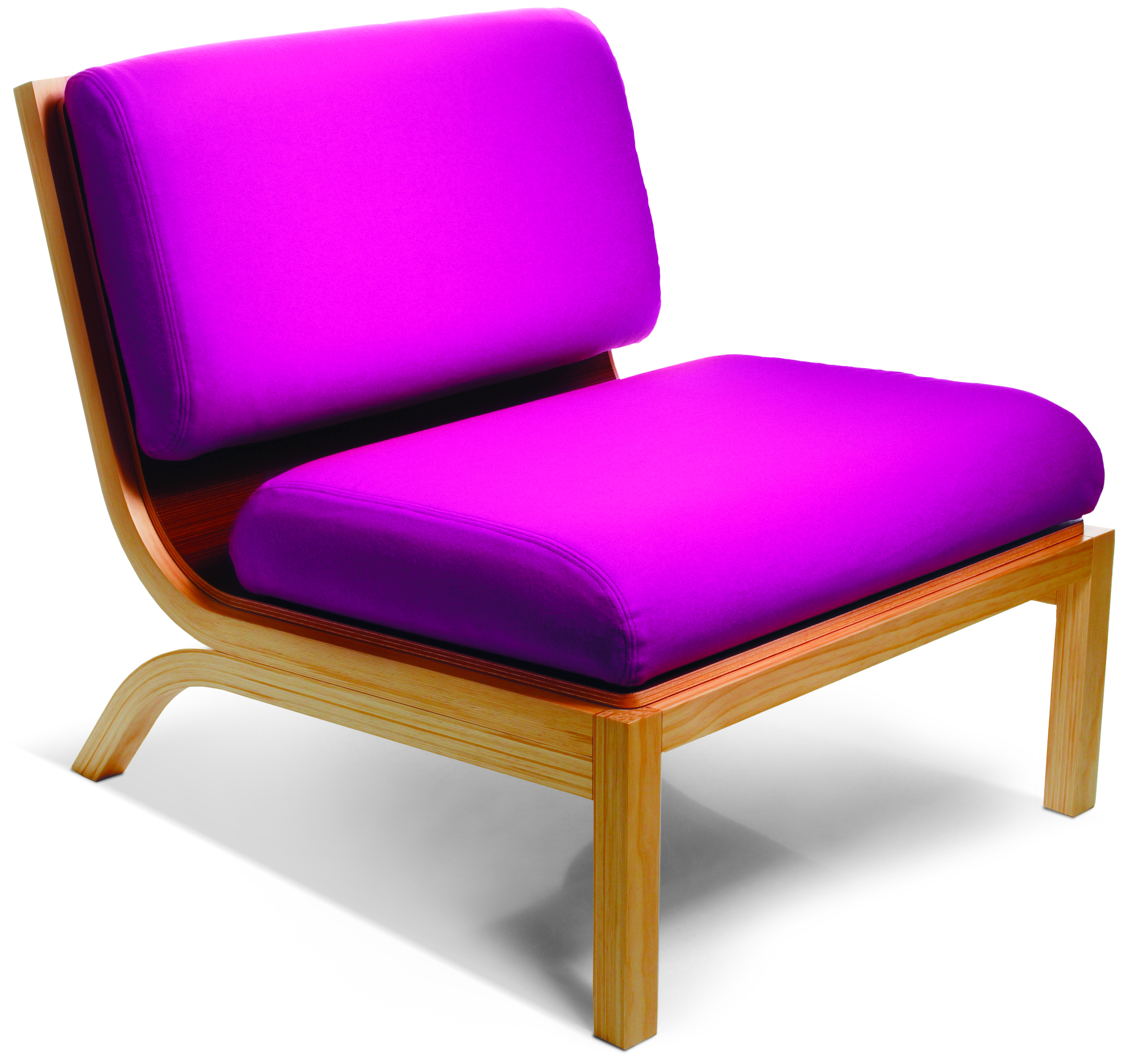

Tio is an experience in creative expression the user can contribute to and enjoy changing as often as they choose, in their own home.
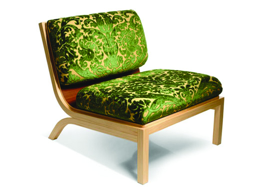
At one level it is a stylishly crafted piece of furniture. But on another level it is the opportunity to creatively transform your living space at will.
The Tio concept is a collaboration of creative minds.
New Zealand innovation and creativity is increasingly making its mark on the world in many fields.
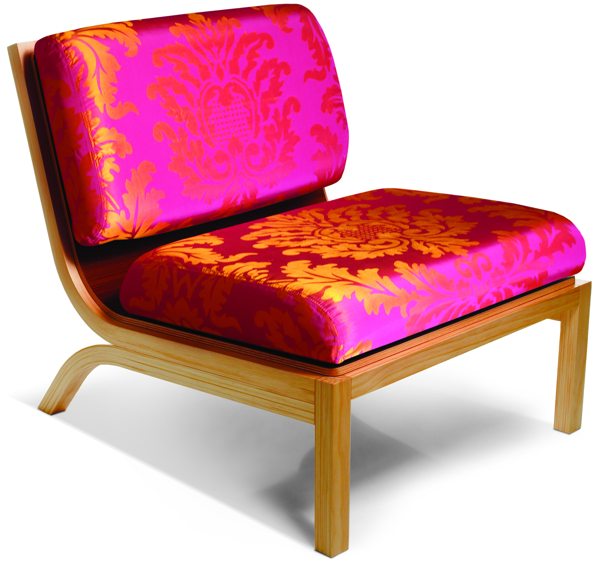
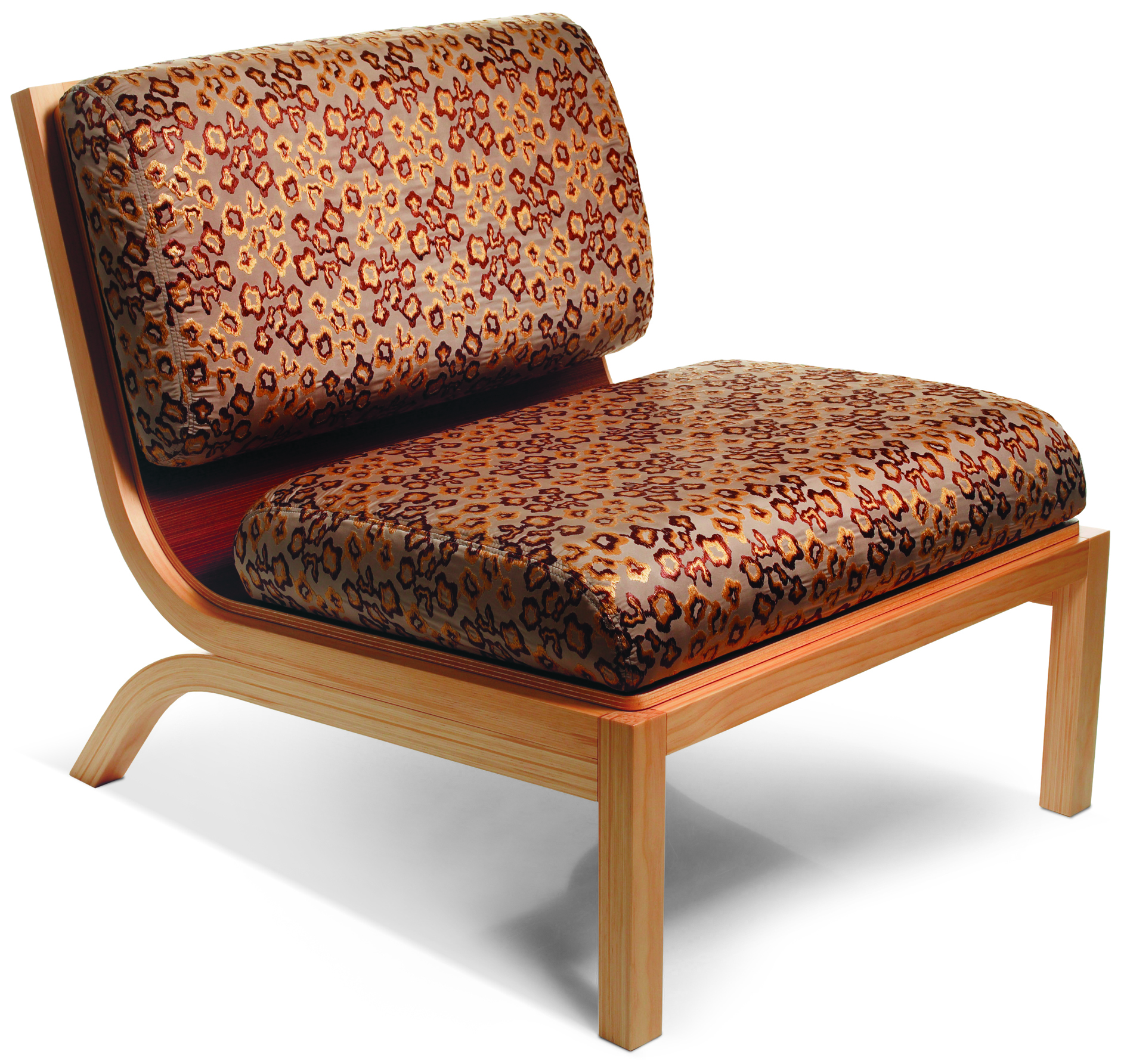
Nowhere is this more true than in fashion design. So Tio features collaboration with the creativity of three of our leading fashion designers, Andrea Moore, World and Zambesi.
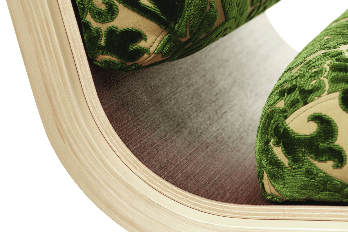
The user can dress their Tio chair in a range of stunning fabrics from each of the designers, and then change it at will.
Tio provides many options for your creativity and will continue to do so.
So far there have been releases in collaboration with artists, designers, fashion houses and more.
The future will bring collaboration across other fields, possibly poetry, perhaps photography , but always fresh and innovative ideas to express creativity.
BACKGROUND
“We loved the idea of being able to “dress” your environment as the mood takes you.”
How can we marry the seasonality of fashion with the permanence of furniture? This was the question that sparked the project. We loved the idea of being able to "dress" your environment as the mood takes you. A tee-shirt for the weekend, a pretty frock for the dinner party, or a comfortable sweater for reading by the fire.
As our research progressed we realised the project was really about collaboration. Collaboration with our in-house design team, with the fashion designers, with our banding company, with local artists and most excitingly with our manufacturers who were very excited to push the sustainability aspects of the project.
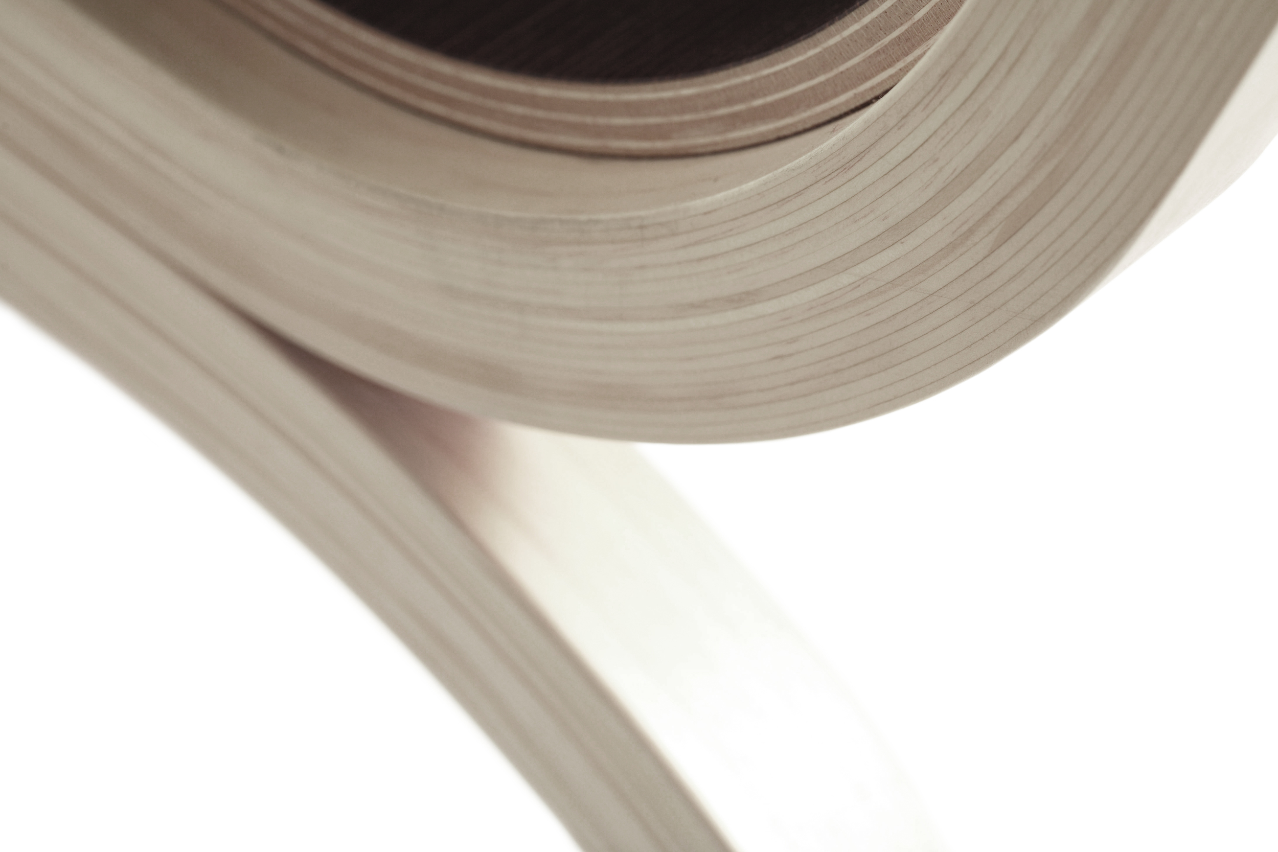
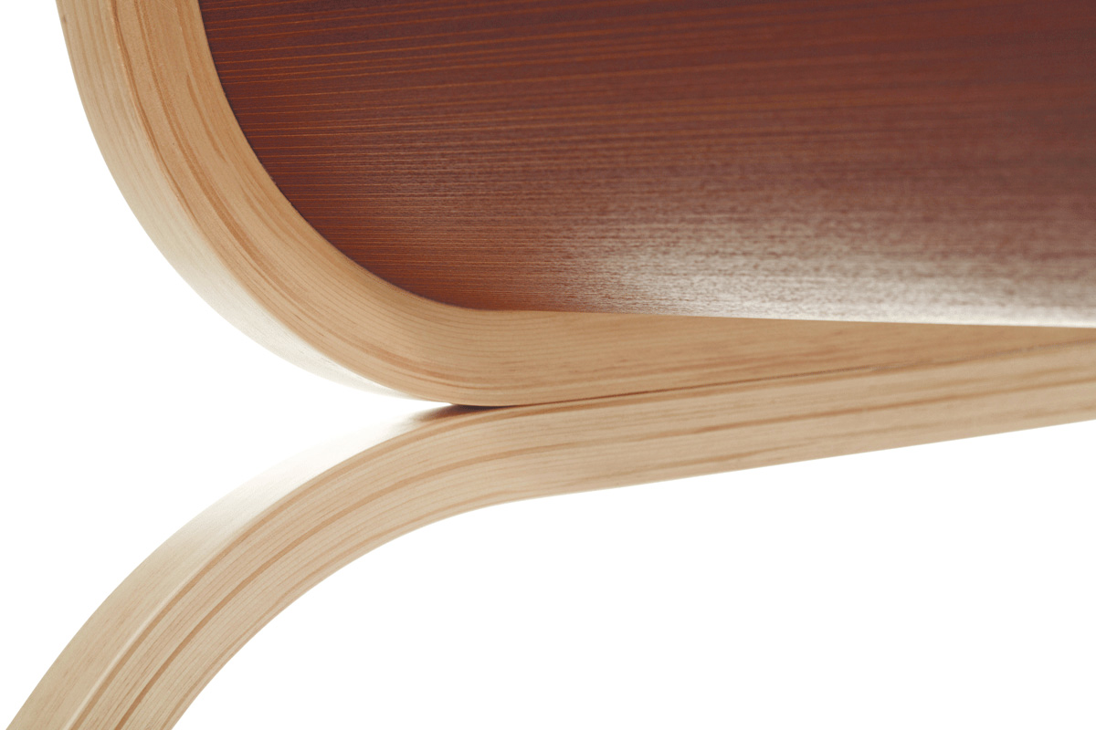
We decided on the chair as the first iteration of the Tio concept. We spent time researching mid-century furniture, in particular scandinavian design as we felt wood would be the right material to hold "clothes. We manipulated different kinds of wood in different ways to see where is would lead us. We eventually developed our own laminating technique and began prototyping in ernest.
SUSTAINABILITY
“The Tio Chair was recognised by the Design Institute of New Zealand when it was awarded Gold at the DINZ Best Awards 2006 in the Sustainable Product Category.”
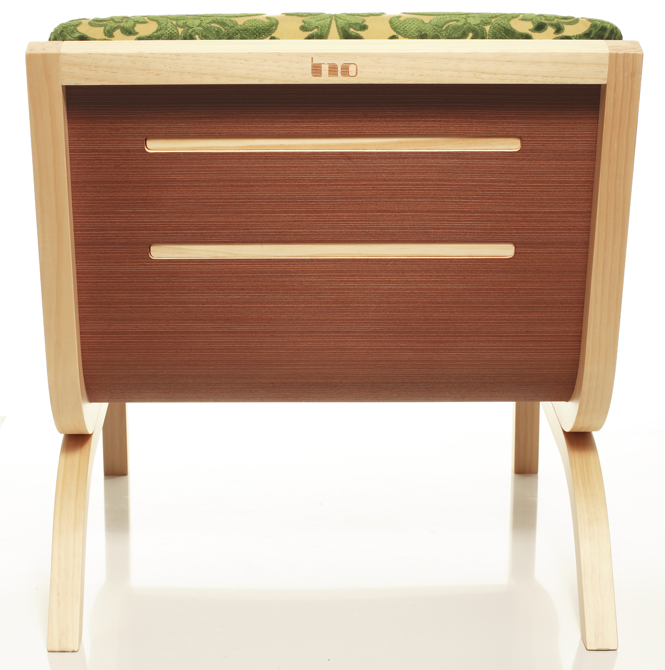
Tio is constructed using heat press lamination. The timber is pine veneer strips stacked in a mold. The pine veneer is waste material salvaged from the off cuts of doors made in the same plant. The dark veneer is a reconstituted plywood product. The base cushion fabric is hemp and the foam cushion is acrylic and completely biodegradable. The plant uses Greenstar rated environmental procedures and all glues are waterborne.
While the construction methods and materials used are all sustainable, it is in the concept where we really tried to create the sustainability. The idea of "dressing" the furniture could potentially increase the product life span. This is where the project really becomes exciting.
The Tio Chair was recognised by the Design Institute of New Zealand when it was awarded Gold at the DINZ Best Awards 2006 in the Sustainable Product Category.
Tio was widely recognised for its green credentials featuring in articles on Core77.com and treehugger.com to name a few.